
The Color of the Year is a big deal in the design industry. Its influence is far-reaching—stretching across multiple platforms including the fashion, furniture, paint and interior design industries.
Just like the clothes you wear, how you decorate your home is a personal decision that most people don’t take lightly. Color has the ability to pull on your heartstrings—it can make you feel happy or sad. It can energize or relax. It can be bold and sassy or soft and soothing.
Whether you lean toward a softer shade of purple or a bright burst of green—thanks to this year’s eclectic crop of top colors—it seems you can’t go wrong with nearly any hue you choose.
By now, anyone following the fashion or home design industry knows that Pantone selected the fresh, energetic, yellow-green hue Greenery as its 2017 Color of the Year. “Greenery bursts forth in 2017 to provide us with the reassurance we yearn for amid a tumultuous social and political environment. Satisfying our growing desire to rejuvenate and revitalize, Greenery symbolizes the reconnection we seek with nature, one another and a larger purpose,” says Leatrice Eiseman, Executive Director of the Pantone Color Institute.
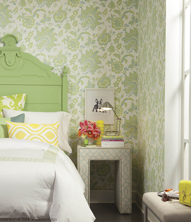
Arabella Aqua wallpaper, from York Wallcoverings, features elegant yellow-green and blue flowers—the perfect accent for a cozy bedroom.
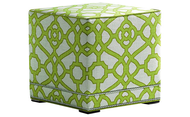
The eclectic pattern featured on the Lulu ottoman by Jessica Charles brings Greenery to the forefront of the design.
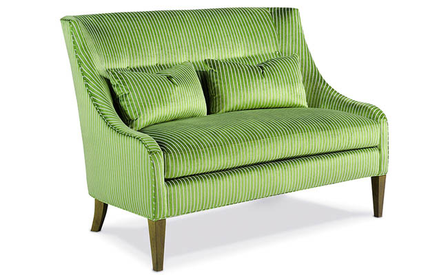
The yellow-green hue of the Perlman Settee from Taylor King features a subtle pin stripe for texture.
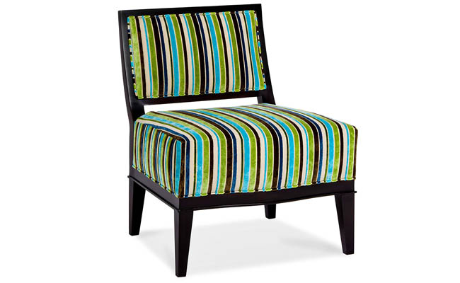
The Keller Chair from Hancock & Moore features an eye-catching striped pattern that incorporates a pop of Greenery with chocolate, navy, cream and bright blue.
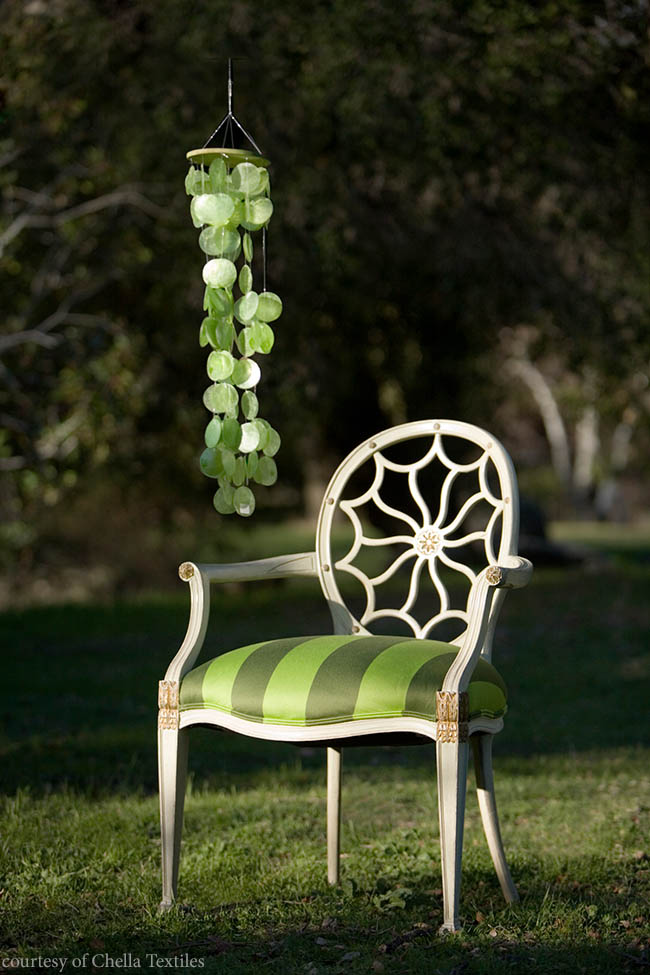
Chella Textiles unveils its Satin Ribbon Stripe fabric in Moss to coincide with Greenery. The durable luxury fabric is mildew and stain resistant, making it perfect for indoor or outdoor use.
2) Poised Taupe
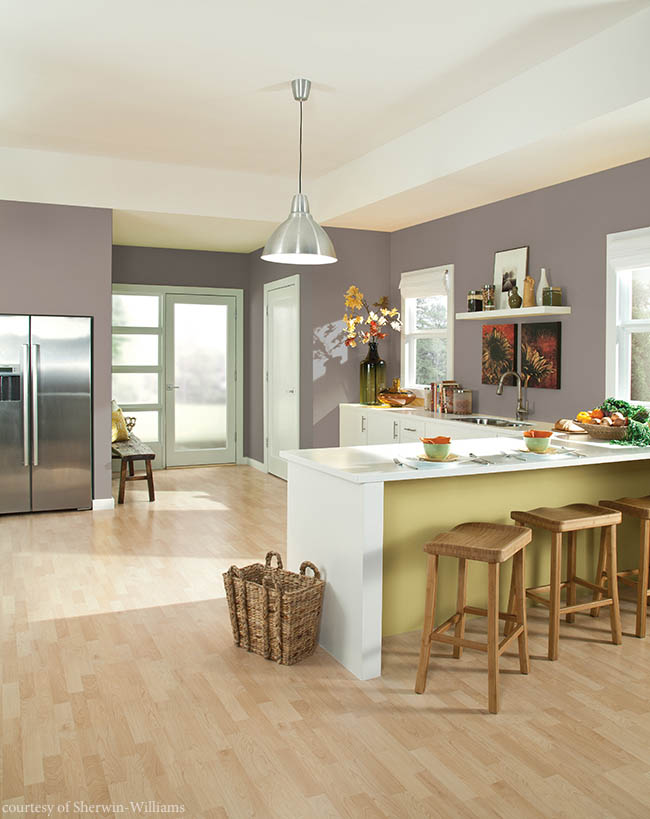
Sherwin-Williams selected Poised Taupe as its 2017 Color of the Year. The neutral shade brings the popularity of gray together with a hint of brown to create a versatile color perfect for any room in the house. “Not cool or warm, nor gray or brown, Poised Taupe is a weathered, woodsy neutral bringing a sense of coziness and harmony that people are seeking,” says Sue Wadden, director of color marketing for Sherwin-Williams.
What’s great about Poised Taupe is its ability to complement a wide range of accent colors—from pale yellow to vibrant red.
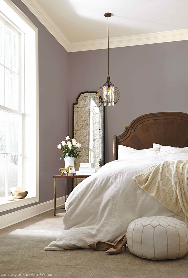
Transitioning away from the monochromatic gray that has been popular the past few years, Poised Taupe from Sherwin-Williams offers a touch of warming brown to traditional taupe.
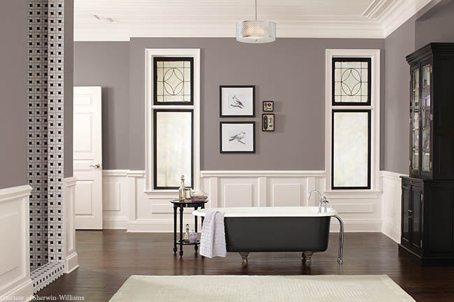
Brilliantly matched with elegant white wainscoting, the walls in this master bathroom feature Poised Taupe by Sherwin-Williams.
3) Cloudberry
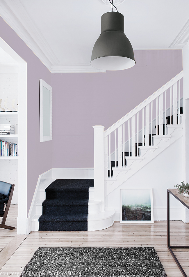
Olympic Paints and Stains is encouraging homeowners to create their own private respite from the everyday rigors of life. The paint company has selected Cloudberry as its top color of the year. The soft violet hue is serene and calming, encouraging people to focus on family rather than the distractions that take place in the outside world. Perfect for the master bedroom or bathroom, and even a modern foyer or family room, Cloudberry can be paired with classic neutrals, such as gray and white, and even black, for the ultimate retreat.
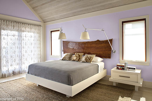
Pair Olympic’s Cloudberry with classic neutrals, such as gray, white or tan to create a simplistic—yet sophisticated—space.
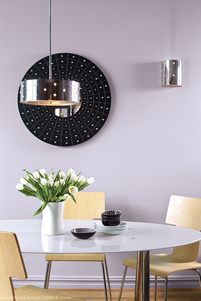
Black accents, such as rugs and light fixtures, perfectly complement the violet tone of Olympic’s Cloudberry.
4) Byzantine Blue
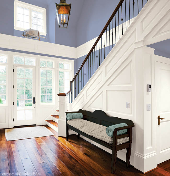
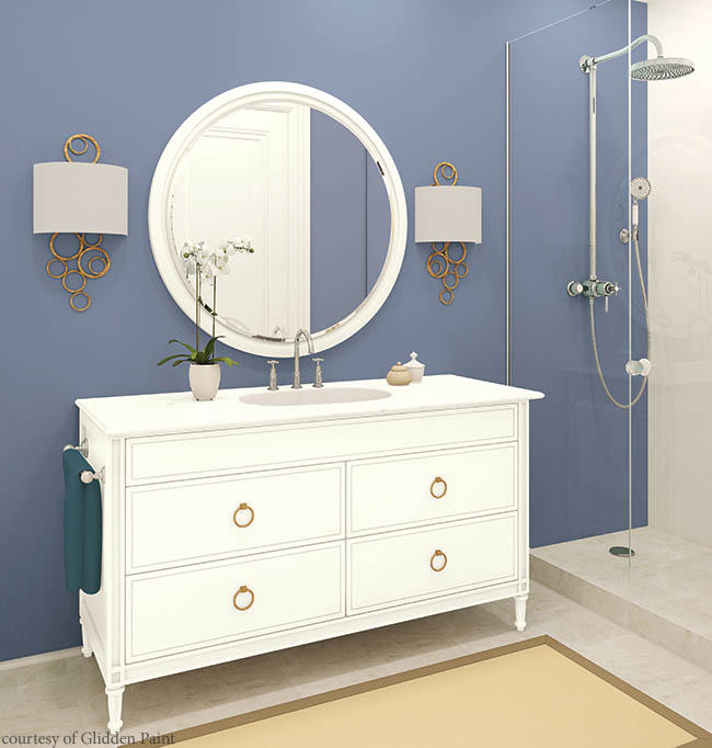
Despite its name, Glidden’s 2017 Color of the Year, Byzantine Blue, is more of a purple in disguise. “It stretches the boundaries of purple to borrow all of the best qualities of blue and gray, making it an appealing color choice for nearly any room,” says Misty Yeomans, PPG color marketing manager for Glidden paint.
What makes Byzantine Blue an interesting color is its ability to appear more gray when paired with darker neutrals, and more blue-purple when matched up with white.
For modern and transitional designs, pair Glidden’s Byzantine Blue with pale beige or bright white.
5) Violet Verbena
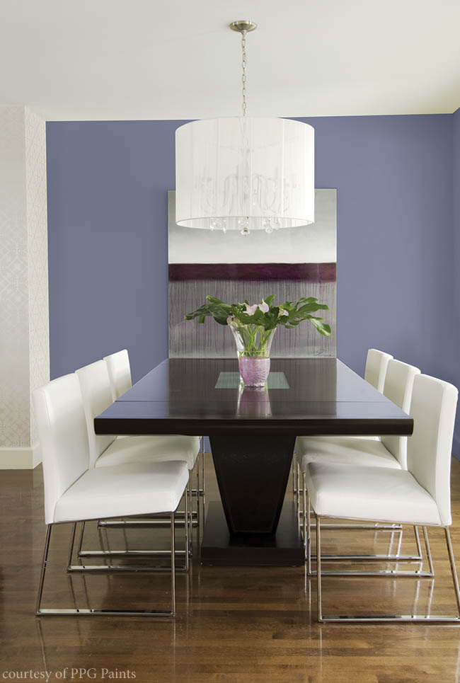
PPG also believes in the power of purple, selecting Violet Verbena as its top color of 2017. The chameleon-like quality of this moody, gray-purple hue allows it to adapt to its surrounding environments and complement a variety of design aesthetics. Its design appeal is far-reaching—when paired with dark neutrals, Violet Verbena unveils gray undertones, but when placed against white, it appears as a purer purple.
“The color is a modern choice for interiors and furnishings, yet it is elegant enough to be incorporated into traditional designs,” says Dee Schlotter, senior color marketing manger for PPG. “Violet Verbena is colorful enough to make a statement, but it can also be considered neutral with its gray undertones.”
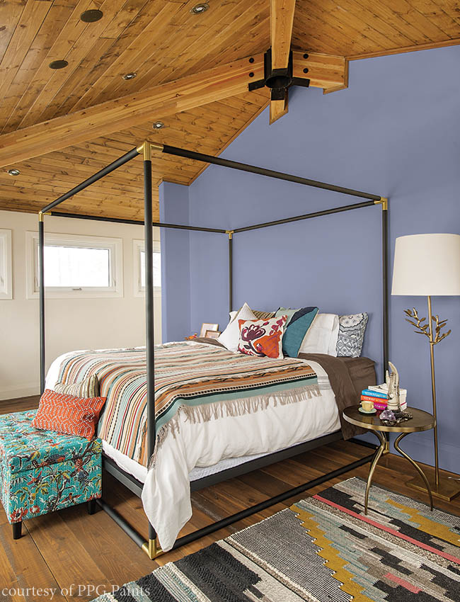
The purple-blue hue of PPG’s Violet Verbena allows it to embrace the middle ground between masculine and feminine.
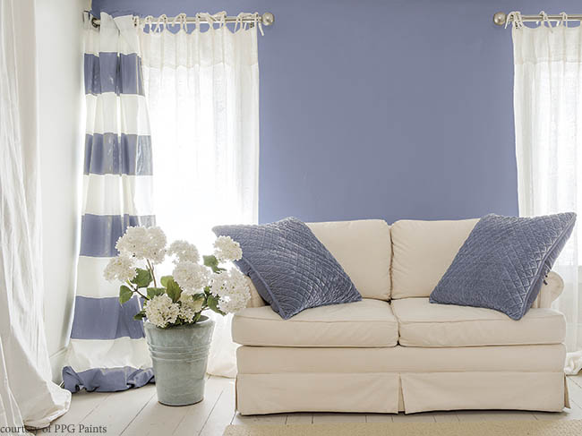
When paired with white, PPG’s Violet Verbena shows its purple side.
6) Shadow
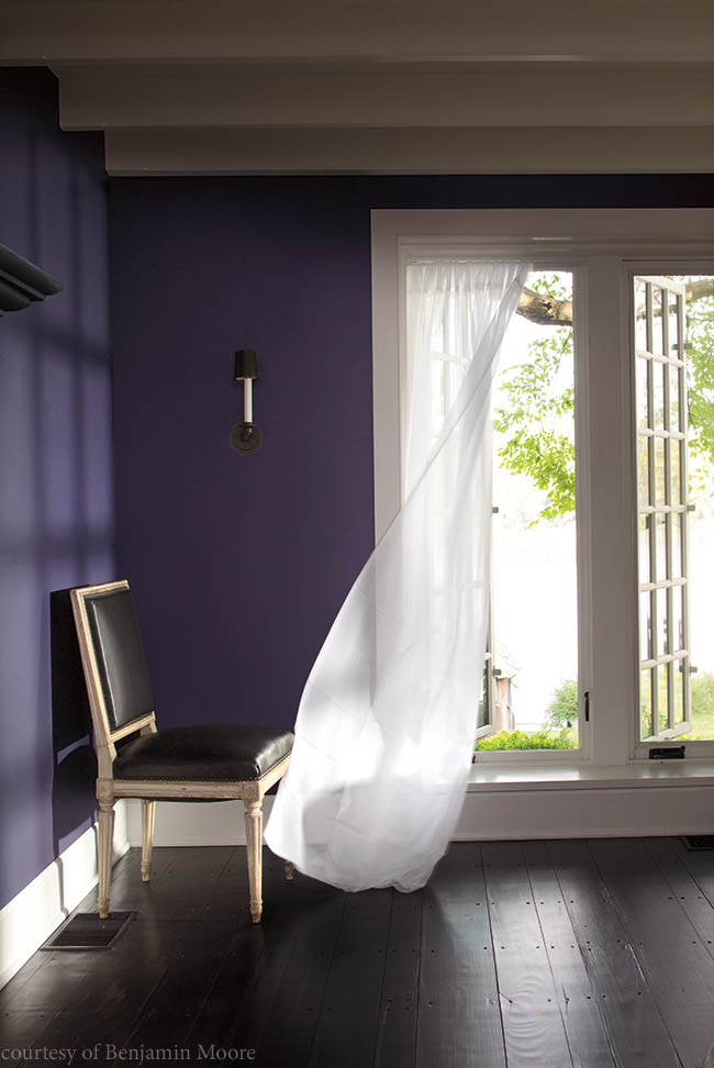
Benjamin Moore selected Shadow as its top color of the year, due to its rich and sophisticated amethyst tone. The dramatic and sultry deep purple hue can transform a master bedroom into a luxurious retreat or a family room into a cozy gathering space. “Elusive and enigmatic, Shadow is a master of ambiance. It is a color that calls to mind a ‘past’, yet it can also make a contemporary, color-confident statement,” says Ellen O’Neill, Benjamin Moore Creative Director. “Shadow is sophisticated, provocative and poetic, it can bring energy to a space or harmony and a moment of respite.”
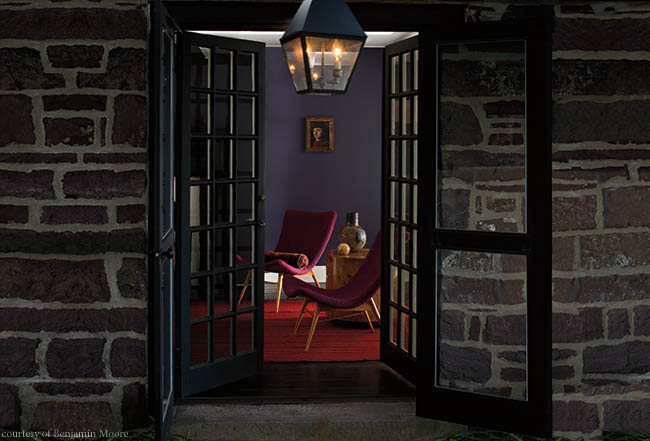
Despite its deep amethyst color, Benjamin Moore’s Shadow works well with bright pops of pink, orange and red.
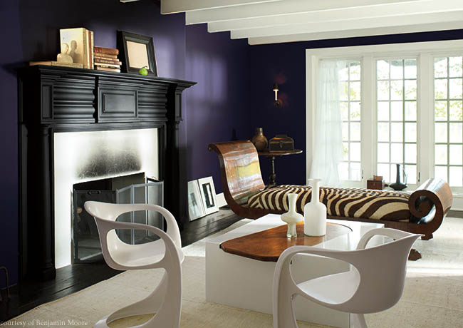
Benjamin Moore’s Shadow sets the mysterious mood in this luxurious living room.