
Photos
Filter

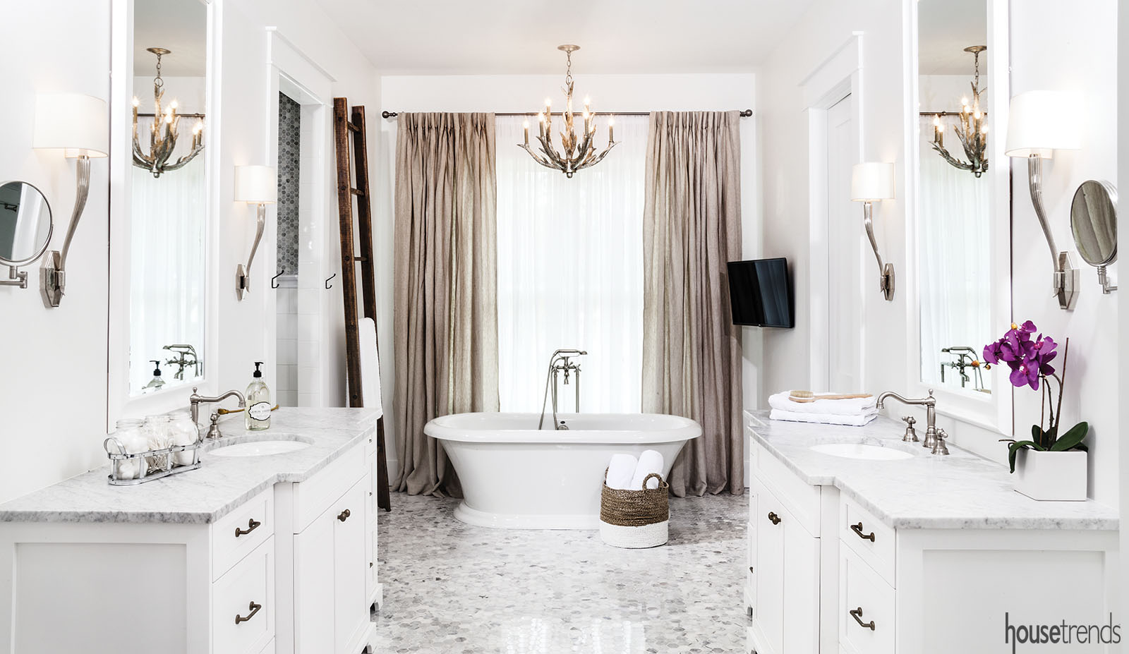
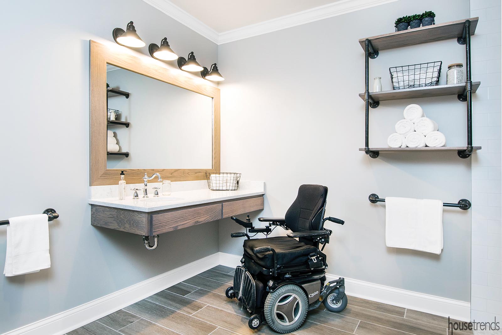
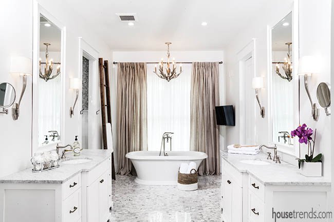
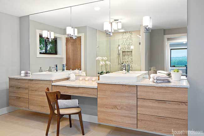
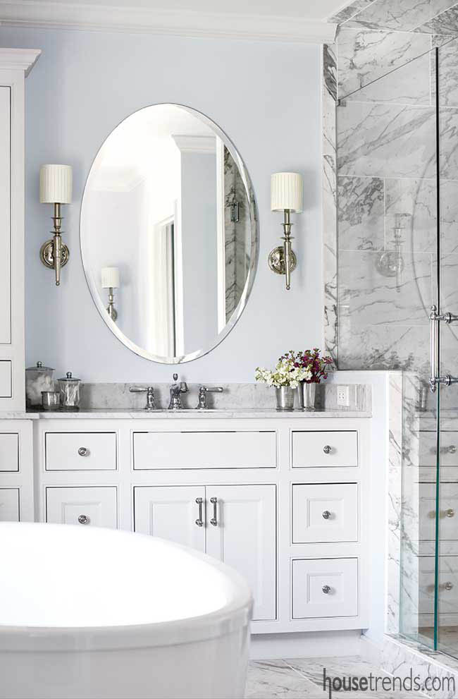
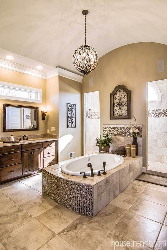
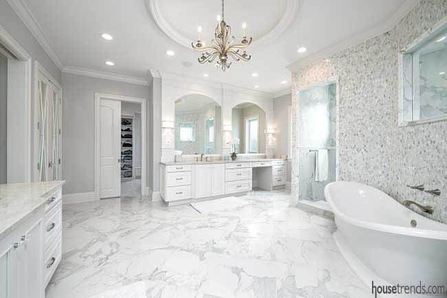
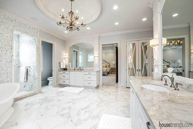
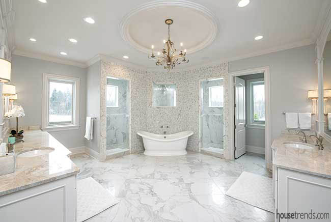
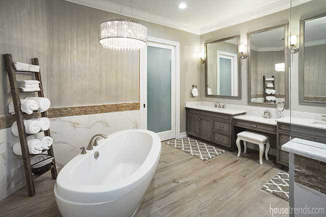
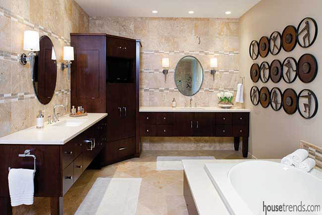
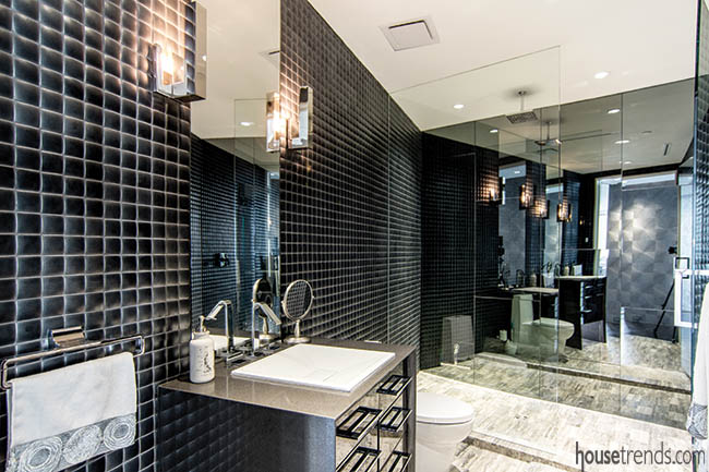
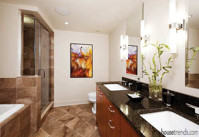
Light the way
The lighting choices in the bathroom were purposeful. “A well-thought-out lighting plan is integral to any room, particularly in bathrooms,” says Muschweck. “You’re doing a lot of close-up work in a bathroom, so you need to see the very best you can.” She added that having layers of lighting also is important in a bathroom so that shadows aren’t cast.
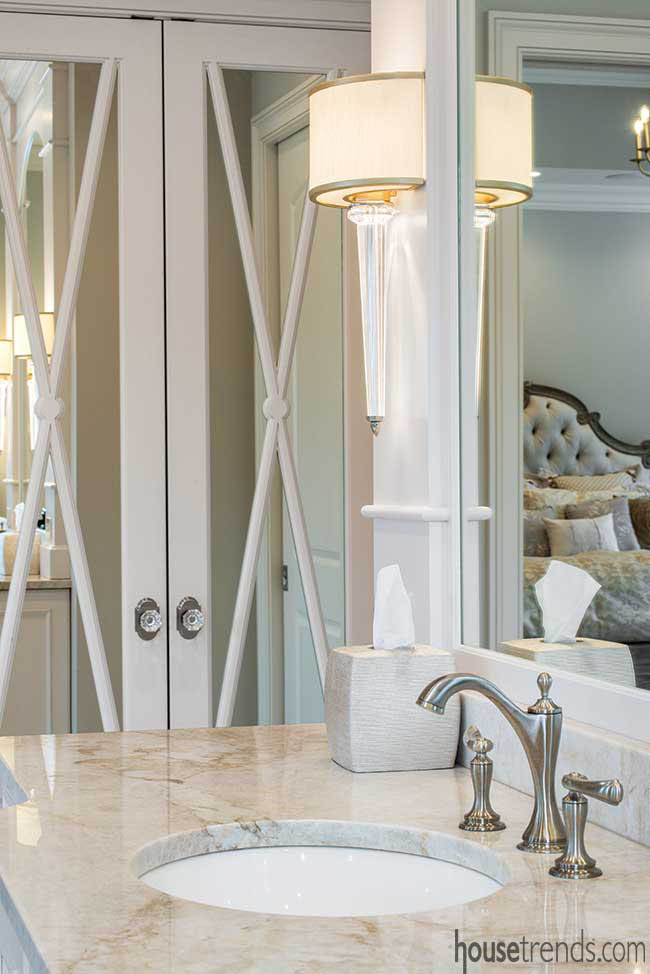
To that end, Muschweck affixed an ornate chandelier, one that speaks to the luxurious surroundings, in conjunction with recessed lighting, along with individual sconces on either side of the mirrors. Though a chandelier is not typical in a bathroom, Muschweck thought that it would provide some visual interest, acting as a piece of art. Plus, the vaulted ceiling with an open skylight is a source of natural light, as is the window, in which a custom cornice was added to give it dimension and texture. Beneath the cornice is a motorized blind for privacy. All of the lighting fixtures are on dimmers so they can be adjusted to the homeowners’ preferences.
The homeowners love all the bells and whistles of the luxurious new space. “It is all pretty spectacular. Everything is a piece of art,” he says.
A fresh look
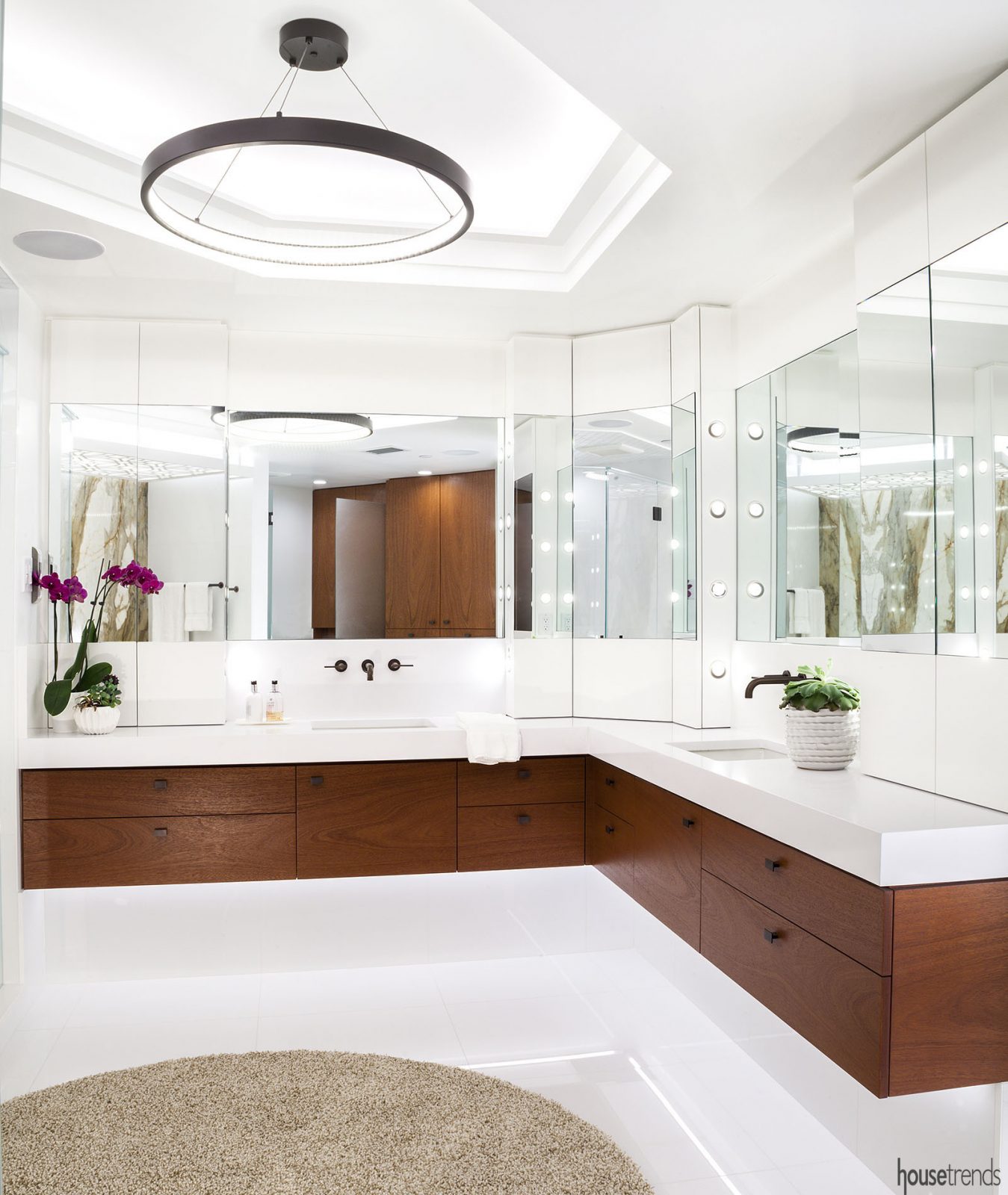
The homeowner and his wife wanted a fresh look for their en suite bathroom, one that was modern and chic, with distinct his and hers domains. The master bathroom was completely gutted and was part of a larger home renovation.
“We built our home 15 years ago; we felt it was time to update it with a new, fresh look,” says the homeowner. The homeowner and his wife gave free rein to interior designer Susan Muschweck and Splash to design a bathroom that is nothing short of a showstopper.
Muschweck says the former bathroom – while large in square footage – looked smaller than it was because of the choppy way it was designed. “The goal was to make it much more modern and efficient with all of the options that are available with plumbing and lighting. This was a very high-end project, so we were shooting for high-end materials and a very timeless design in a fairly new home,” she says.
The designer utilized the existing footprint but had to shift things around, such as removing a closet here and moving a door there, in order to attain the open feel.
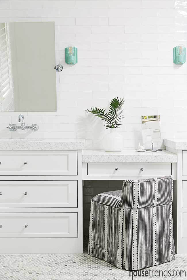
“The bathroom was designed to be similar to what you would find at a spa.” The bathroom has a welcoming aura with a historic window from the original home located high within one of the exterior walls, and a dresser with sinks on top as the vanity.
It was important to John that he stay true to the integrity of the original structure. A bit of a history buff, he began to research the lineage of the home. He managed to get his hands on an incredibly detailed set of blueprints after tracking down information on the original owner and then contacting his sons.
A rarely used full pool bath in this area was reduced to a half bath, with the rest of the space being repurposed into a walk-in pantry. A nearby butler’s pantry connecting the dining room was also removed to make way for an elevator, which conveniently opens directly adjacent to the upstairs master suite.
Accentuating the positive
Kenneth had already lived in the building, but wanted to relocate to a larger suite. He purchased the unit and then enlisted the help of close friend and interior designer Rita Bateman. “It all started when I first gave Rita a call and she had some really good design ideas for me,” Kenneth says. “The lighting plan was what excited me the most about the renovation; it completely opened up the place. Accent lights over the paintings really helped the look. Rita dropped the ceiling about three inches and added more LED lights. Those two items really helped, in my opinion, to enhance the place.”
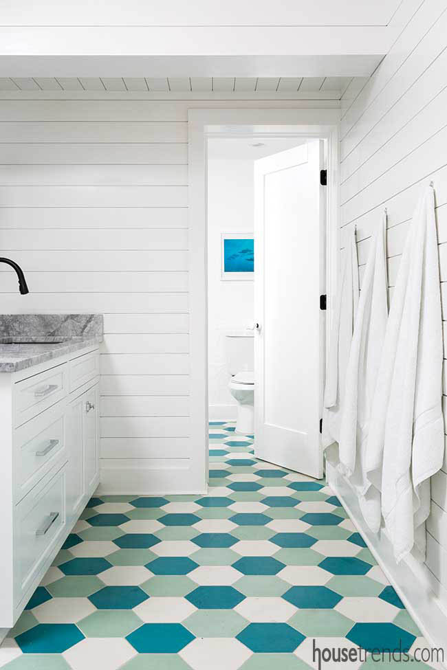
The laundry room evolved into an extended space off of the pool, a boost for the Morrisons, who have young children and wanted to make it easier to reach the pool bath without traipsing through the house. In the hall bathroom, white shiplap and colorful handmade hexagon tile, courtesy of Cement Tile Shop in Tampa, reign supreme. “We especially liked the tile because the neighborhood – Old Northeast – is now restoring some of the hexagon sidewalks and we wanted to tie the home into the neighborhood,” explains Becky. “We love the area, the history and that the home is on the water.”
Coastal-inspired design
The home’s former living room and dining room were transformed into the master suite, and while there was no plumbing in this space previously, the master bathroom looks like it was simply meant to be.
“The master bath is designed to mimic a private spa with a large two-person walk-in shower, dual sinks, beverage bar and a beautiful free-standing soaking tub, also with a water view.”
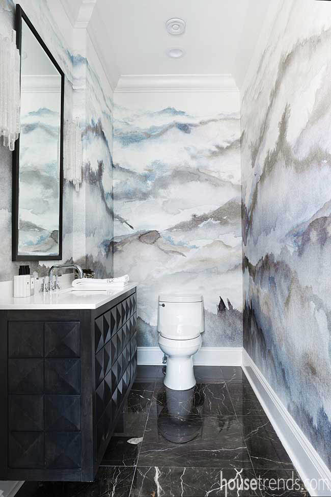
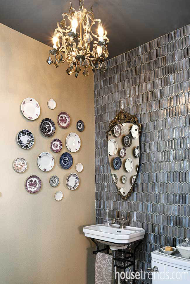
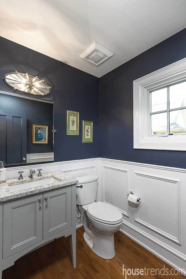
A great deal of personality is packed into this small powder room with vintage pieces stealing the show. A wall of elongated hexagon-shaped silver glass tile with touches of soft grays, browns and whites adds a visual dimension that shifts endlessly with the play of light and shadow.
Resources: Contractor: Collamore Built; Designer: Laura Crawford, LJC Interiors; Paint: Sherwin-Williams Versatile Gray; Tile: Komorebi elongated hexagon in Mineral Ice
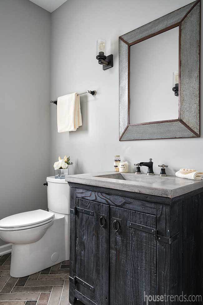
Add a tasteful touch with tile
To add to the modern farmhouse feel that runs through the rest of this home, the designer chose brick-size tiles for this bathroom’s floor in colors that picked up on the vanity and countertop. The tiles were installed in a herringbone pattern to give it a bit more of a punch.
Resources: Contractor: The Cleary Company; Designer: Laura Watson, ASID, UDCP; Paint color: Sherwin-Williams Light French Gray; Floor tile: Crossville Brick Lane 3×12 Olive, installed in classic herringbone pattern
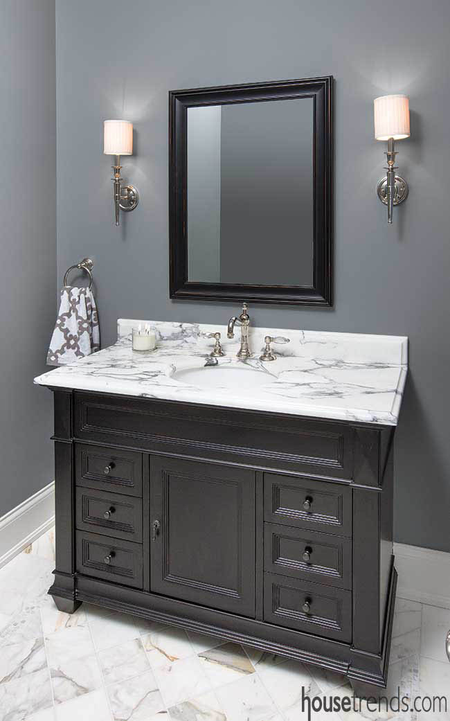
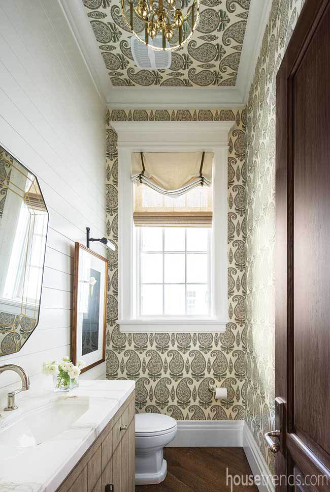
Creating a new space while using the owner’s vintage mirror and chandelier demanded a mixture of classic fresh elements such as; white painted nickel board, a polished nickel faucet, and a marble countertop. When paired with the paisley wall covering and the Roman shade the designer created a soft welcoming half bath.
Resources: Contractor: Ken Keller Development; Designer: Wendy Smith, Smith Interiors; Paint color: Benjamin Moore Dove Wing; Wallpaper name: Michael S. Smith Jasper Kashimir
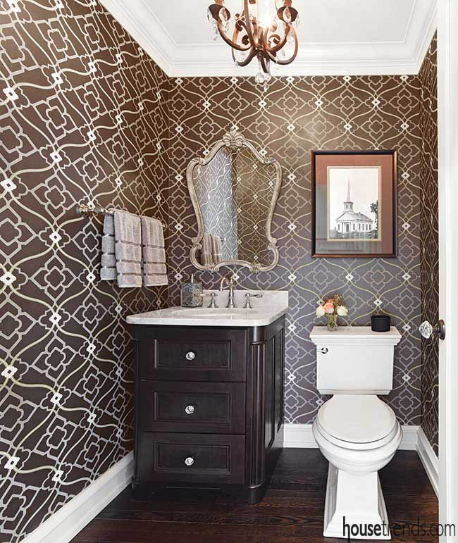
This powder room was relocated to allow more space for a kitchen renovation. Its new hallway location fits the natural flow of traffic through the home. The wallpaper is layered with a diamond and arabesque trellis, and atop that, an ogee design. The variety of textures, lines, and colors create a pleasing large-scale look.
Resources: Contractor: Renovations Unlimited; Designer: Homeowner; Wallpaper: Zuma from Candice Olson
Build Remodelers; Designer: Wendy Sorenson and Andrea Conley; Wallpaper: DL
Couch, Versa Box, PRISM
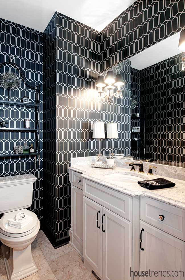
Make it pop with paper
Wanting this room to be really special, the homeowner was willing to take a bit more of a risk with its design. The first sample of this wallpaper the designers showed her was taupe. When she saw the color options she decided to go with the dramatic black version. The designers agreed it was the perfect choice.
Resources: Contractor: Dave Fox Design
Wanting to keep with the traditional feel of this home, which was built in 1918, the designer matched the detail of the dining room’s wainscoting for this adjacent half bath. Seen in the mirror is a blue door that swings between this room and the butler’s pantry which has its walls, cabinets and ceiling all painted the same blue.
Resources: Contractor: J.S. Brown & Co.; Design consultant: Courtney Bowe; Paint color: Cyberspace by Sherwin-Williams
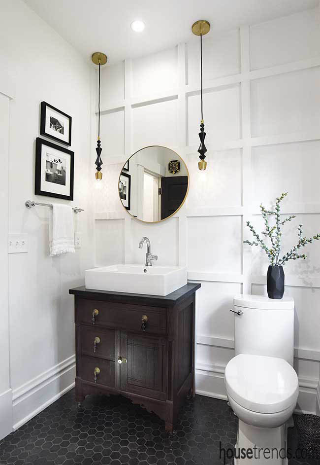
Walls that work with wood
By simply adding a grid of 1″x 3″ strips of poplar to this accent wall, the designer added a classic element to the space with a subtle touch. While it is painted a crisp white, the wall is anything but plain, as the wooden details transform it from a simple white wall to one with dimension and shadows.
Resources: Contractor: Collamore Built; Designer: Laura Crawford, LJC Interiors; Vanity: Custom from antique washstand
In this handsome half bath, the designer created a wall treatment that, while it looks like custom paneling, is actually a simple applied wood molding done with 3/4″ wide squared MDF trim. Then she painted it the wall color in a high gloss sheen to make it more durable.
Resources: Contractor: Steve Dubell; Designer: Wendy Smith, Smith Interiors; Paint name: Benjamin Moore Manchester Tan
It was these visits—and their affinity for outdoor entertaining—that led them to craft a pool bath. A quaint space complete with bathroom and changing areas, it’s a remedy to keeping wet feet and bathing suits from dripping on the floors indoors.
Then there are the ever-so-subtle edits that may not be immediately noticeable but make the home look “more fresh and modern,” Christine explains.
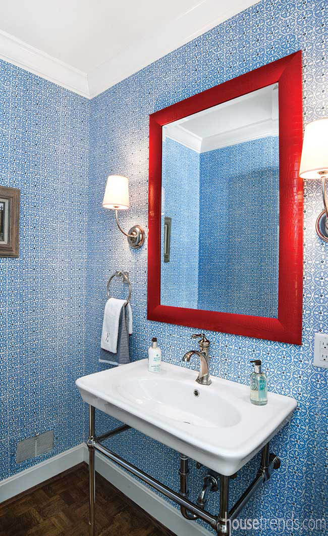
An attention-grabbing red-framed mirror in the powder room, for example, and orange-red window treatments in the master suite brighten these serene settings with bold pops of color. Unique accessories also play a role: An antiqued brass “bird light,” as Josh calls it, is an exuberant accomplice for the dining room wallpaper, while sconces made from animal horns relax the formality of the living room.
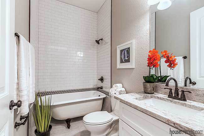
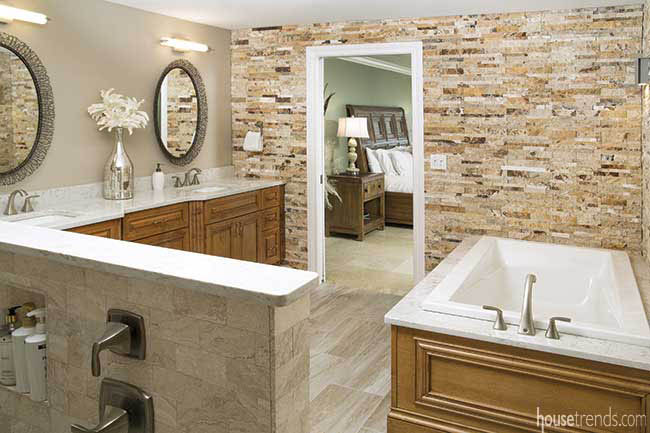
To keep the design elements uniform throughout the home, the granite countertops and cabinets in the master bathroom match those in the kitchen, as does the subway tile over the old-fashioned clawfoot bathtub. Standard fixtures keep the space neutral while adding a touch of elegance. A separate shower is across the room.
“We tried to meld the old style with new style, so it would look like an old historic bungalow with a front porch, HardiePlank® lap siding that mimics the look of real wood, and a detached garage. We also made the home energy efficient,” says Mercer. These energy efficient elements include Energy Star appliances, upgraded insulation, gaskets around lights, and energy efficient windows.
Architectural details that make the home look as if it was a part of the original neighborhood include the gable vents at the top of the house; exposed rafters with beadboard sheathing; tapered columns; and large window trim. A porte cochère to the left of the front porch, as well as the Craftsman-style columns, further aligns with the other Arts and Crafts homes in the Seminole Heights neighborhood.
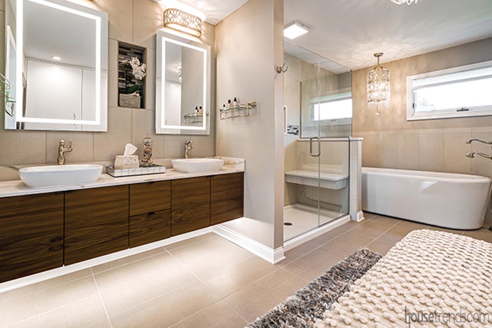
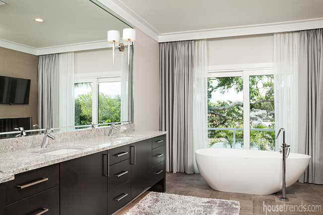
With its less-is-more feeling, an open master bedroom frames the spectacular view and is the gateway to a one-of-a-kind master bathroom. “We wanted a very large walk-in shower and a large walk-in closet that could be accessed from the bathroom,” the owner points out. “It makes getting dressed easy.” An outstanding spa bathtub is framed with curved ceilings, and a full wall allows entry on both sides into a door-less wraparound shower. Porcelain tiles on the floor, walls and accent pieces were masterfully blended with the stonework.
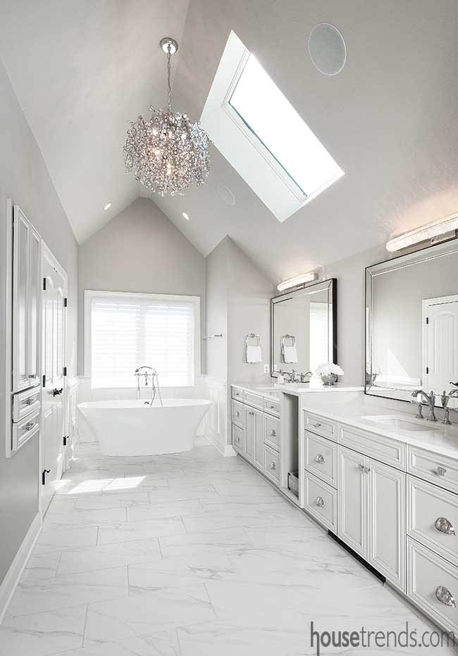
A barn door custom made by Barrington leads into the master bathroom. Billmann wanted a classic, clean, spa-like master bath. She chose white quartz for her countertops, with classic basket-weave chrome fixtures and handles. The freestanding soaking tub, with its sprayer, maintains heat for as long as the bath lasts. Like the large open spaces throughout the rest of the home, the two-showerhead shower is oversized. The skylight lends natural light to the bright space, as additional light shines through the crystal chandelier.
The upstairs of the house has four bedrooms and three bathrooms, with more rooms on the third floor as well. When the time comes for family gatherings and holidays, the couple now has plenty of room to host their adult children and their growing families. “We absolutely love this house,” she concludes, and he jokes, “We’ve downsized to a larger house.”
Master of the house
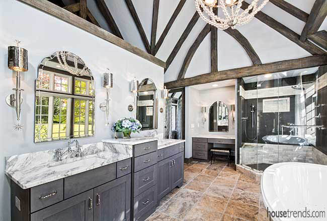
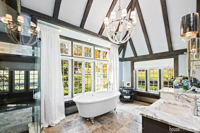
The “porch room” on the first floor was a very large and open space, akin to a ballroom, likely used for entertaining back in the day. The couple didn’t initially have a vision for how they would use this expansive space adorned with characteristic Tudor beams across the ceiling. As the design plans evolved, their desire for a first floor master suite became apparent, however all of the original bedrooms were located upstairs. The porch room was the perfect solution. It offered enough space to construct a comfortably sized master suite on the first floor with the benefit of not disturbing the original footprint or exterior of the house. The couple did not want to alter those elements in order to maintain the original look.
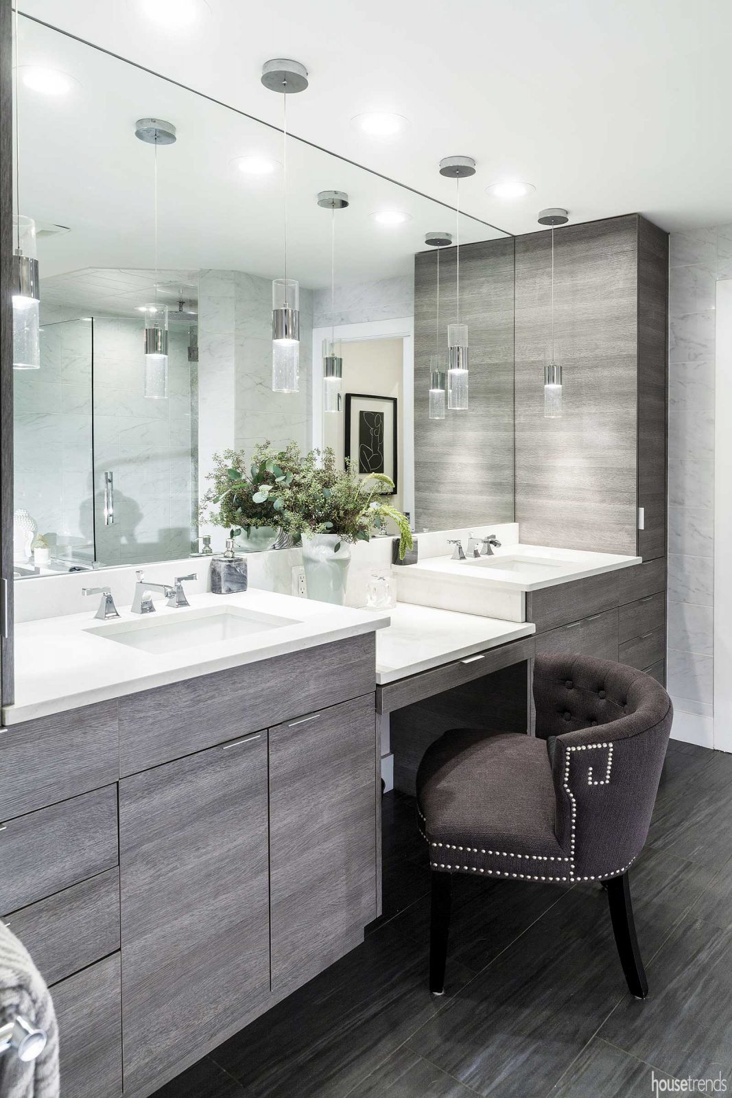
Elbow room
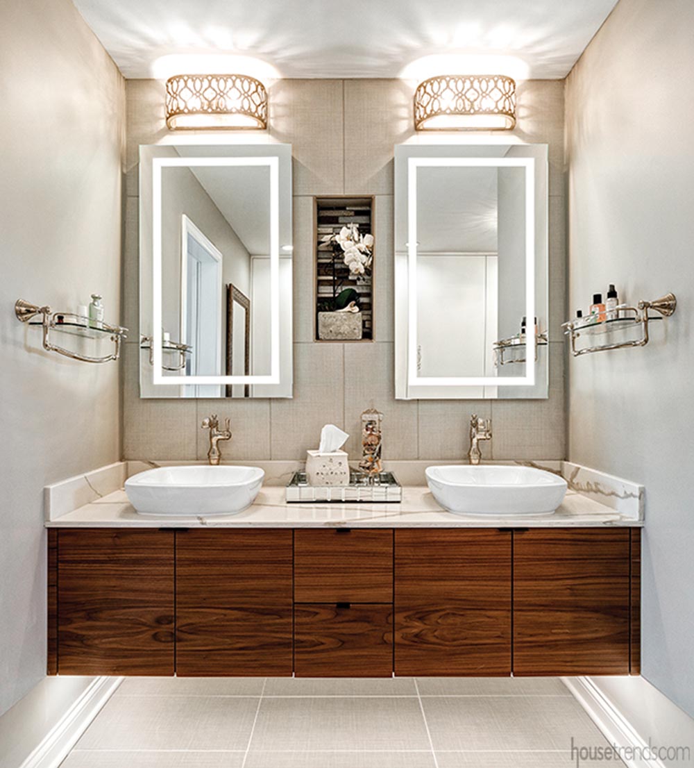
Located across the room from one another, the vanities give this happy couple plenty of leg—and elbow—room for maneuvering and getting ready for the day. Looking to add some interest to the light cabinetry, Denise says they added a little bump to the front of both vanities. “It jogs out on an angle when you get to the sink base, and then it jogs back in,” says Denise. “Rather than just being a straight vanity, we wanted to add some character and bump it out.”
Though both are topped by a gorgeous Taj Mahal granite, the two vanities offer subtle differences that reflect their respective users’ lifestyles. Both have plenty of storage underneath and a generous amount of counter space, but hers also features an area where she can sit down to do her makeup. His boasts a reverse osmosis system, a filter that turns the water into drinking water. “Since we have well water we put them in the kitchen and most of the bathrooms,” says the wife.
The whole home took about two years to complete, a wait that was worth it as the owners now have their dream bathroom, among other rooms. Although the wife admits, “The master bathroom is one of my favorite rooms in the house.” With music piping softly through speakers and a variety of design features included to maximize comfort and increase relaxation, it’s not exactly hard to see why.
Washing the day away
The shower itself was designed with two in mind. Dual entrances flank either side of it, each leading to a specific set of showerheads that the owners can program to reflect their own preferences, choosing everything from temperature to which combinations of sprays they would like (showerhead, rainhead, or body sprays). “My husband and I can have our own settings and can turn it on by a remote control before we get in,” she says.
Worried about cold feet against the Calacatta tile, they went ahead with a heated floor, both in the shower and out, that can be easily manipulated from a control mounted on the wall. Keeping a further eye to their comfort, they decided to add a towel rack just inside of the shower openings, far enough away from the spray to remain dry.
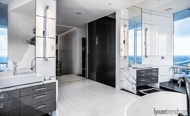
There was a time when his and hers simply meant a longer-than-normal bathroom vanity interrupted by two sinks…one for him, and one for her. Elbows still bumped, and you can bet that the coveted counter space was the root of many an argument at the dinner table. As the times have changed, though, so has our concept of bathroom design. Why settle for just two sinks, when you can have two completely separate vanities? In fact, why not just carve this shared area into two different spaces that merge to give the illusion of being one beautiful room? And that is exactly what one Bath couple did. “You can never have enough counter space. Now I’ve got my space and he’s got his space,” the wife says happily.
“She wanted a lot of storage space,” recalls Darlene Somrak of Somrak Kitchens. Part of a collection of skilled professionals who worked on this new home, Somrak’s crew was tasked with creating the perfect vanities for a homeowner who knew just what she wanted. “She always had pictures, even that first day,” says Darlene of the two-year project.
Let the light shine in
It’s a daring move—letting so many windows pepper the walls of your bathroom. Where most people would use textured glass or thick window treatments to obscure any view that nosy neighbors might have, this couple balked tradition and left their windows completely unadorned. It helps that their property is fairly private, extensive enough to allow for this family to spend time paintballing and four-wheeling in their own back yard. The shoulder-height windows let in the abundance of natural light that the wife craved. “I didn’t want the shower to be dark,” she says. “We have four windows in the shower. It’s great, we really don’t even have to turn lights on, except at night.”
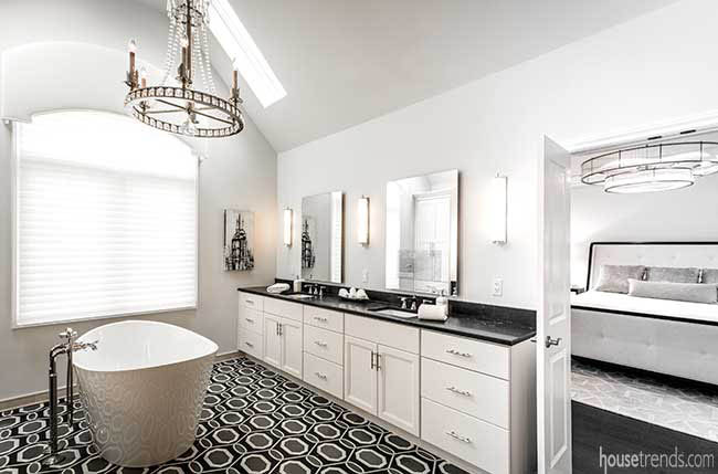
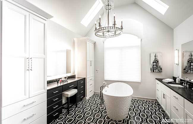
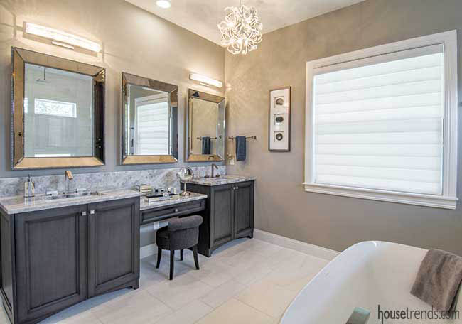
When it came to designing Mike and Sheila’s new master bathroom, Van Selow remembers the initial inspiration being a picture of an egg-shaped soaking tub. “Sheila knew she wanted a soaking tub, and it works perfectly in the space because there are no other curves in the room – except in the chandelier,” she explains.
“They have the biggest shower we’ve ever done,” Van Selow says of the massive shower in the renovated downstairs suite. “The original space had two closets, glass block, and the tub was in the center. It was a major renovation.”
Despite the transformation, Van Selow describes how they repurposed the original vanity by raising it up on a pedestal and running tile underneath to give it a built-in appearance. The tub surround was built to replicate the vanity, and it pops against the two tiled walls of the space.
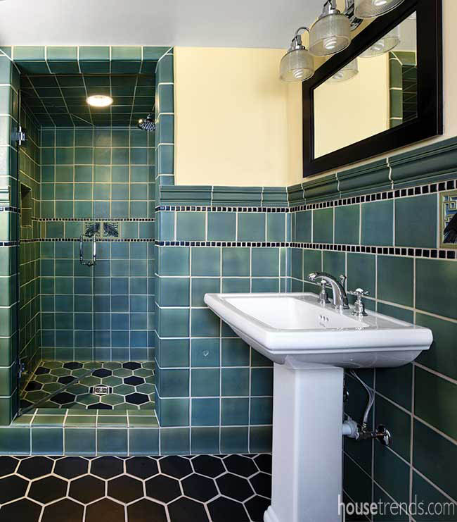
The highlight of the guest bathroom is the Whitman Rook tiles seen on the pedestal sink wall and in the shower. These tiles are from historic molds shown in Rookwood’s 1912 catalog. Paired with 6×6-inch field tile and Bellamy molding in a beautiful green color, the bathroom is a true homage to days gone by. “Some of these tiles were part of the Heritage collection featured in our architectural catalogs from the 1920’s,” says James Malone, sales associate with Rookwood Pottery Company. “The homeowners wanted to stay true to the age of the house. These tiles helped to achieve that desire.”
The honeycomb-inspired design of the black hexagon flooring further completes the vintage look. “My husband wanted to add the black hexagon tile. He was even able to help lay the tile in this bathroom,” says the wife. “At first I was worried that the black tile would stand out too much, but he really made a great design decision.”
Thinking ahead, Lee and Keith thought it wise to put a shower in the downstairs bathroom. With 18 steps to the second floor, and if one of them were to sustain an injury, they would have the capability of ambulating on the first floor. “There are lots of stand-out features here, starting with the pyramid ceiling,” says Lee. “You may not even notice it, but it just frames the crystal chandelier, which isn’t something that you normally see in a bathroom.”
The wallpaper has a newspaper backing, and much like making a collage, it is applied by ripping off pieces, before adhering them to the wall. Layers of color give it depth, and a metallic look.
Checkeye was given a basic guideline to follow in the master bath. The idea was to design something very “Zen-like,” and nothing too fancy. The designer used marble on the walls and the floor. “We had a few large walls for artwork and found a wonderful three-dimensional sculpture which added texture to the smooth surfaces,” says Checkeye. Cabinets were raised from the floor, giving the illusion that they are floating in the air.
As an example of Seldes’ attention to detail, she planned a sit-down area between the vanities since Ruth prefers to apply her makeup seated. “Every client has different tastes, so I must be flexible and give them more than one option,” Seldes says. “The decision about whether the closet is placed before the bath—as Ruth and Gary have it—or on the far side of the bath always required lots of discussion. So I don’t impose my preference; I listen and deliver what the client really wants.”
Unique features add interest
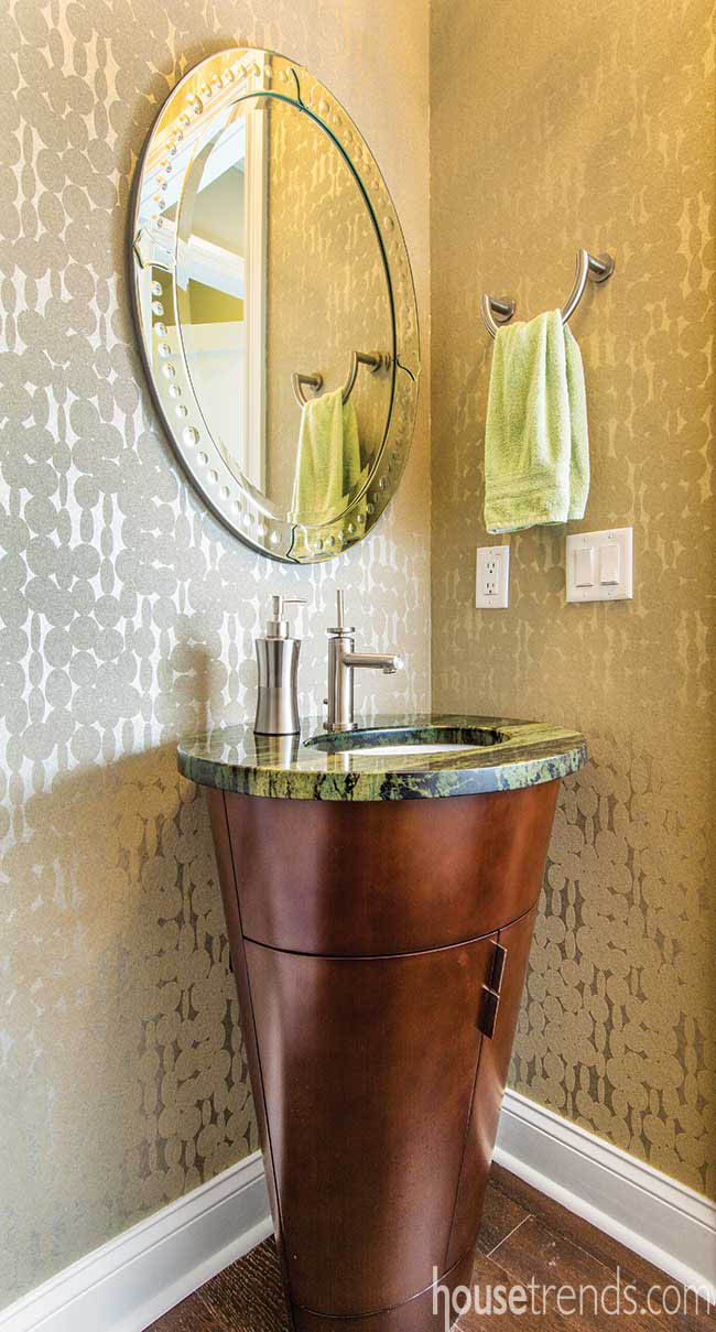
In addition to a beautiful flowing floor plan, the homeowners made sure that each space makes a statement. The powder room on the main floor features glass-beaded wallpaper, a large circular mirror and a unique cone-shaped vanity. Topped with green granite, the wooden base boasts a complex copper stain.
Everything in the condo was gutted except for the master bathroom, which only required a touch-up and cabinet façade painting. The homeowners credit Marksberry with developing several great space-saving ideas. “In the living room, she eliminated the coffee table and added some smaller tables that slide under the couch. We also have a smaller eating area and got rid of the dining room, which was a big factor for us because we simply weren’t using a formal dining room,” the husband says. “We now use our kitchen area for work and eating. We tend to all congregate in the same area at the same time. Because of what Dee did with the condo, we use every room and don’t feel like we’ve missed anything being in a smaller space.”
Complete with a variety of materials including impressive tile, textured wallpaper and elegant pops of color, guests are sure to feel pampered in the penthouse.
The master level
While there is another guest suite on the third level of the penthouse, this space is all about the master suite.
At the top of the stairs is the crown jewel of the master suite—the master bathroom. Much like the kitchen, the tile work in the master bathroom is the centerpiece. The walls, covered in Ann Sacks White Thassos rectangular tile and adorned with Sicis Platinum accent strips, serve as the perfect backdrop to the space.
The inviting master suite boasts an oversized walk-in closet offering a center storage island and plenty of shoe racks. The focal point of the adjoining bathroom is a sleek, modern Kohler soaking tub, centered in the space. Two separate vanities, topped with the same Cambria quartz seen in the kitchen, are recessed into the entry wall, opposite a wall of glass, which encloses the water closet and the Kohler DTV Bluetooth shower system. The digital shower system allows the user to control the water temperature and the spray patterns of the six showerheads from an iPad.
In 25 years as an interior designer, Debbie Rosenthal has never done a house like this one. In fact, never repeating herself is her trademark, as is creating spaces that are timeless and difficult to categorize.
“I sort of pride myself on not having a specific look,” says Rosenthal. “I like the change.”
Part of this philosophy is market-driven. Cleveland is not a big enough market for a designer to be too myopic or specific. There needs to be flexibility for long-term success. The other factor that leads to this modus operandi is Rosenthal’s own need to be creative. She likes to stay on her toes and interpret each individual client’s wishes and needs in a new way.
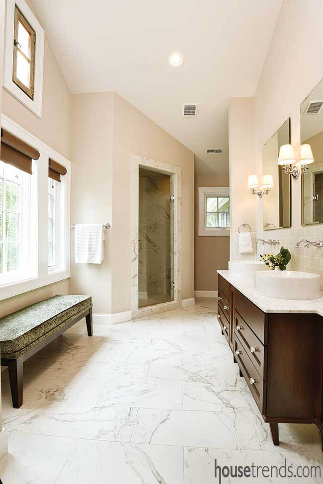
With a whirlpool tub in place, and his and her sinks, the master bath gives off a spa feel. The marble floor climbs the walls of the sizable walk-in shower, and the rain showerhead was set high to accommodate the owner who stands at 6’4″.
Watching the movements of the city below is a favorite pastime for the couple. “I don’t mind when the Fort Pitt Bridge is bumper to bumper, as long as I’m not in it,” laughs the owner.
“This was very different for us to build because Dayton is a very traditional town,” says John Albrecht, owner of Albrecht Custom Homes & Wood Interiors. “It was nice to do something different and it was a lot of fun.”
Albrecht, who handled all of the build outs for Performance Place, hired local designer Denis Bruss with Gene Zimmerman’s Interior Design Studio to transform the shell into a one-of-a-kind living space. Patty shared her vision of the space and let the duo loose to handle the rest. Both Bruss and Albrecht were floored by the freedom they’d been given to design and even more pleased when Patty loved what they dreamed up.
During the 10-month renovation, contractor Greg Nelson of Nelson Construction & Renovations, Inc. stripped the home back to its original splendor. Everything was replaced—from the sewage to the electrical systems to the plumbing and the structural enhancements. The home’s fireplaces, floors, crown molding, exterior finishes and windows were all restored.
Dion McMullen, owner of Londonbury Homes, was the builder on the most recent remodel. He says while it was unusual to remodel such a fairly new unit, owners often want to put their own personality into their living spaces. “The open-space design and the size of the kitchen/great room is not something you see in these downtown buildings too often,” McMullen says.
To accomplish her design goals, Amy eliminated a bedroom, bathroom and hallway and expanded a galley kitchen to create an elongated, open-concept living space that incorporated the dining room, kitchen and great room.
An outdoor lover, Amy wanted to include an earthy, natural look into her surroundings. “I love things that are reclaimed, that have a restored look,” she says.