
From fashion to interior design, color plays an important role in our daily lives. Each year, some of the most influential experts in the industry announce their top colors of the year. Marsala, Poised Taupe, Violet Verbena and Greenery are just a few of the eclectic hues bestowed the honor the last few years. This year’s crop of top colors runs the gamut, from sultry green to lively coral. It’s up to you to decide which color speaks to you.
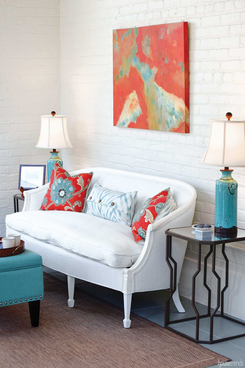
Living Coral
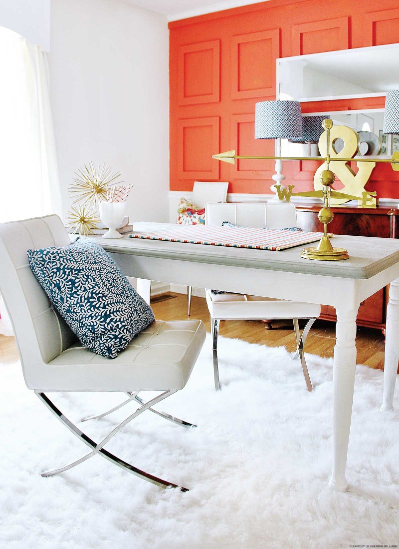
Pantone’s pick for its 2019 Color of the Year is Living Coral. The optimistic shade of coral features a golden undertone, creating the perfect combination of energy and warmth.
“Color is an equalizing lens through which we experience our natural and digital realities and this is particularly true for Living Coral. With consumers craving human interaction and social connection, the humanizing and heartening qualities displayed by the convivial Pantone Living Coral hit a responsive chord,” says Leatrice Eiseman, executive director of the Pantone Color Institute.
This lively accent color looks great in virtually any space. Consider using Living Coral as an accent wall color in a home office, or incorporate it into a living room or sunroom via quaint chairs, luxurious rugs and throw pillows or eye-catching wall art.
Metropolitan
Gray has long been the go-to color in home design—and Benjamin Moore believes the love affair with this neutral is still going strong. Metropolitan, a clean and crisp light gray with cool undertones, is the paint company’s top color of 2019. “Comforting, composed and effortlessly sophisticated, Metropolitan exudes beauty and balance,” says Ellen O’Neill, Benjamin Moore director of strategic design intelligence. “It’s a color in the neutral spectrum that references a contemplative state of mind and design.”
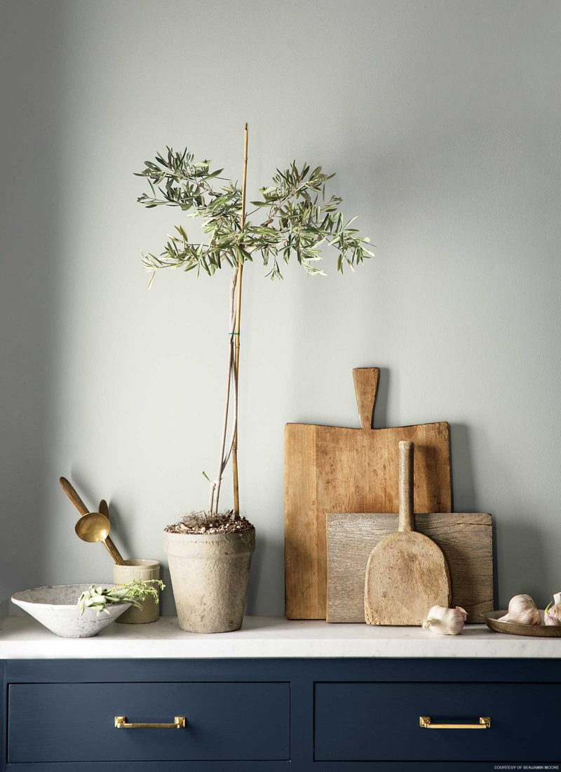
The soothing shade is synonymous with peace and tranquility, making it the perfect choice for virtually any room in your house. It has the ability to bring a calming sense of relief to a master suite or establish a stress-free environment in your family room.
Cavern Clay
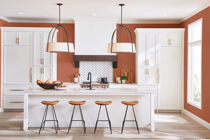
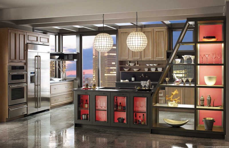
Cavern Clay, a warm terracotta hue, is Sherwin-Williams’ top color pick of the year. The earthy, desert-inspired color works well in casual or formal environments.
“Cavern Clay is an easy way to bring the warmth of the outdoors in. Envision beaches, canyons and deserts, and sun-washed late summer afternoons—all of this embodied in one color,” says Sue Wadden, director of color marketing for Sherwin-Williams.
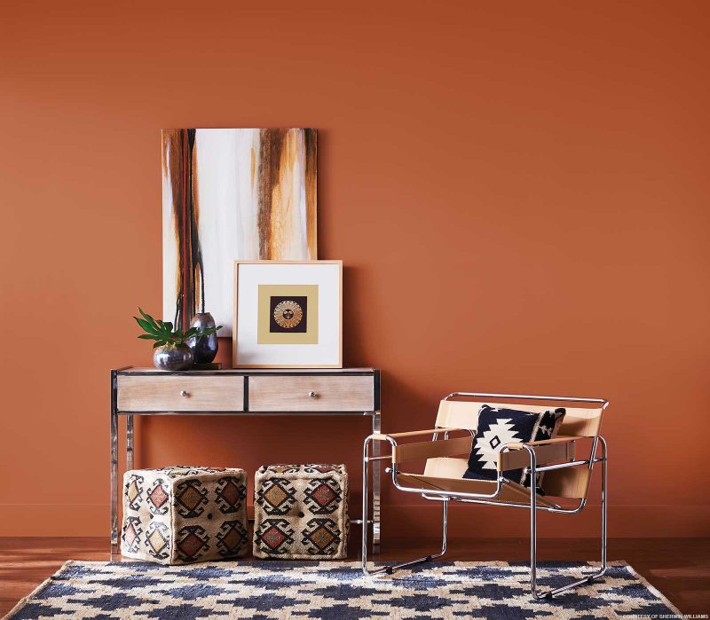
Consider Cavern Clay as the perfect backdrop to a welcoming living room or kitchen. It works well when paired with classic natural elements such as wood and stone and even complements dark navy blue and black accent pieces such as chairs and lighting.
Night Watch
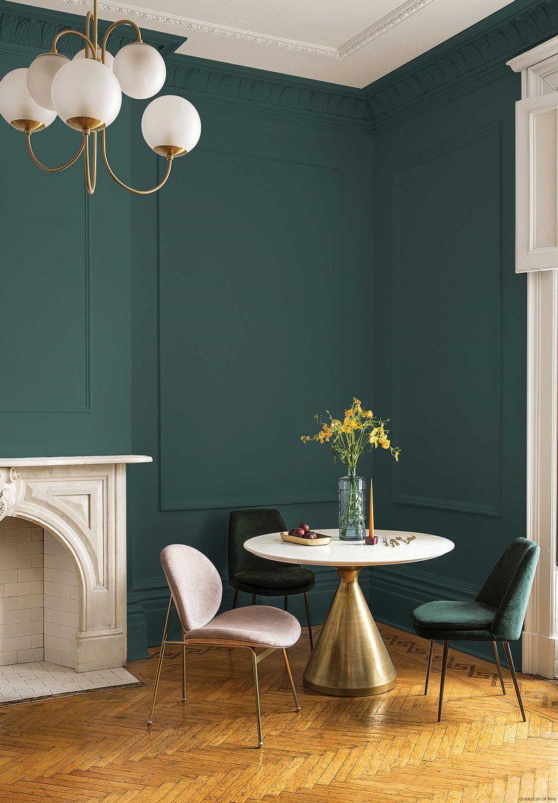
PPG relied on the power of nature when it selected Night Watch as its 2019 Color of the Year. The luxuriously rich green allows you to bring the healing power of nature right into your home. “The restorative power of nature is important in society now more than ever,” explains Dee Schlotter, PPG senior color marketing manager. “The dark green hue of Night Watch pulls our memories of natural environments to the surface to recreate the calming, invigorating euphoria we feel when in nature.”
Night Watch is a versatile color that can be incorporated into a variety of spaces and design elements. Consider it as a focal accent wall in a living room or dining room. It pairs nicely with gold or brass accents and bright pops of blue and orange.
Article appeared in Housetrends Tampa Bay – March/April 2018